Overview
This development project of the University of Moratuwa is another step taken in revitalizing existing student activities in the University. The long term need for a fully pledge student centre for common activities, conference facilities, emergency attention, student rest rooms, counseling rooms, up to date cafeteria and entertainment gathering area all that integrates the necessary activities of students (reading, making models, discussing etc.), was a dire necessity and evident at the University.
The challenge our practice had to face was the strict budget allocated for the project, as the economy of the country was in the down turn due to the heavy expenditure in combating the civil war and decline in the government Revenue. The brief was simple, the design approach must enhance the University and Student Center and canteen setting,
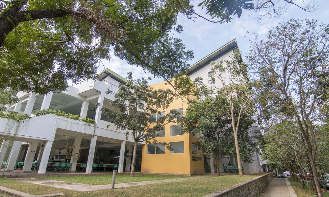
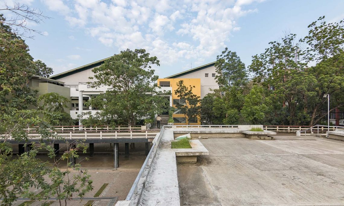
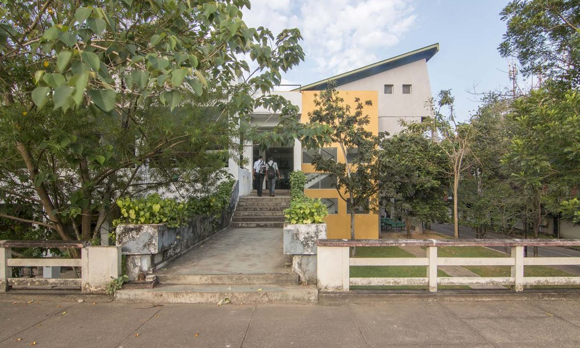
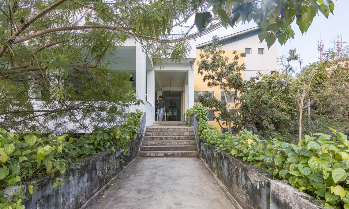
The design concept is to achieve the phenomenon of “None building”. When the building is in full swim, a person approach the building along the main access (the axis of bridge), his view on the “Sumandasa” the main faculty building (known as the University of Moratuwa icon) is not obstructed horizontally or vertically.
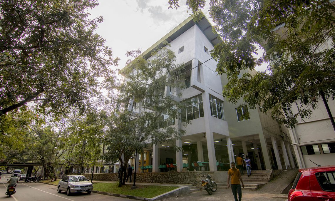
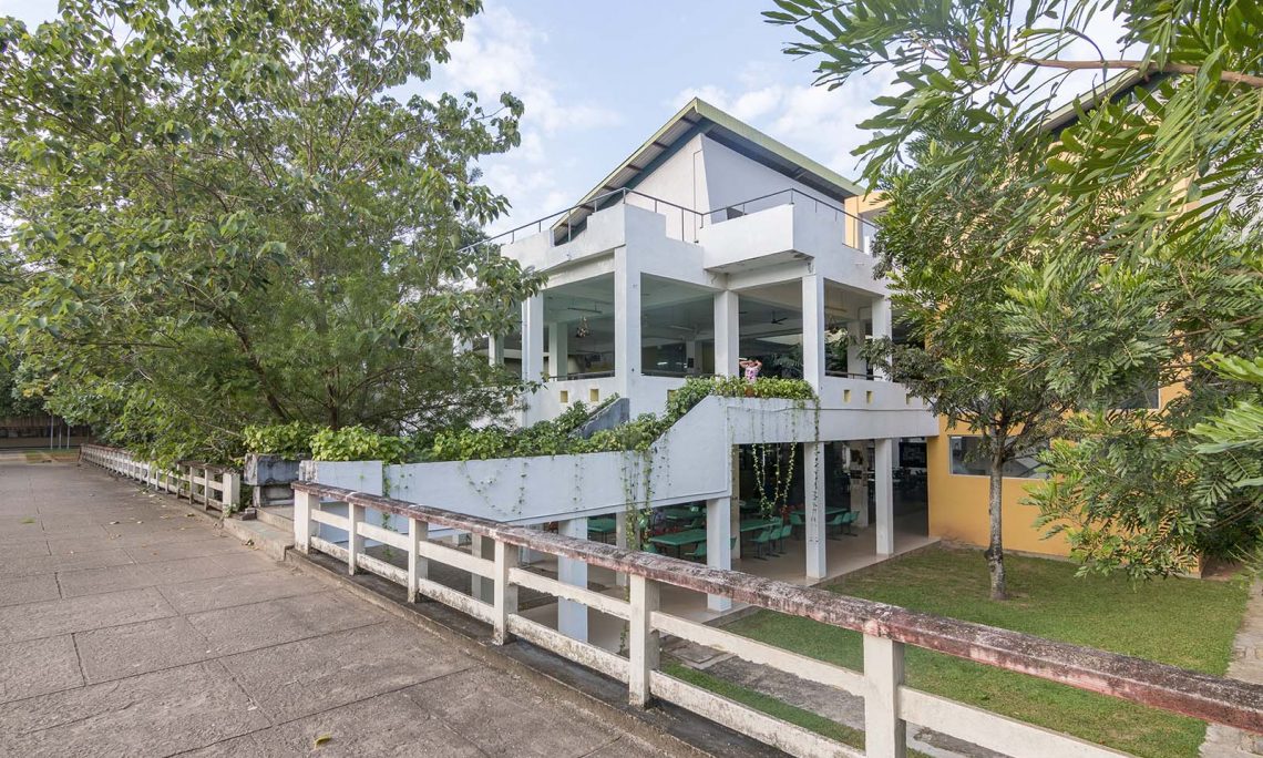
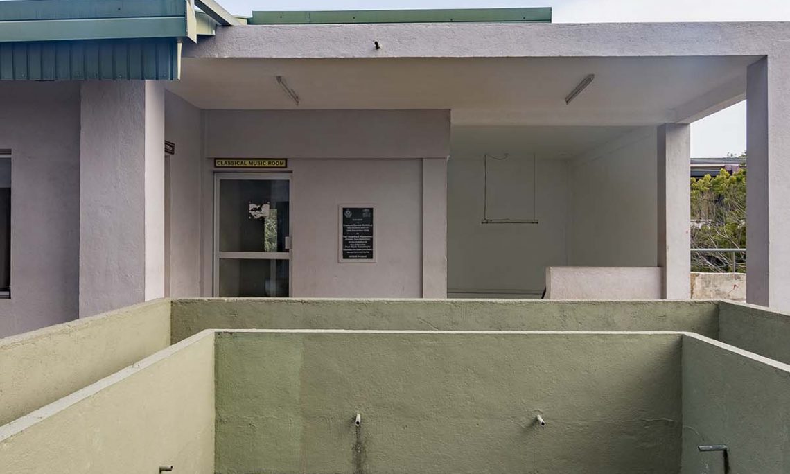
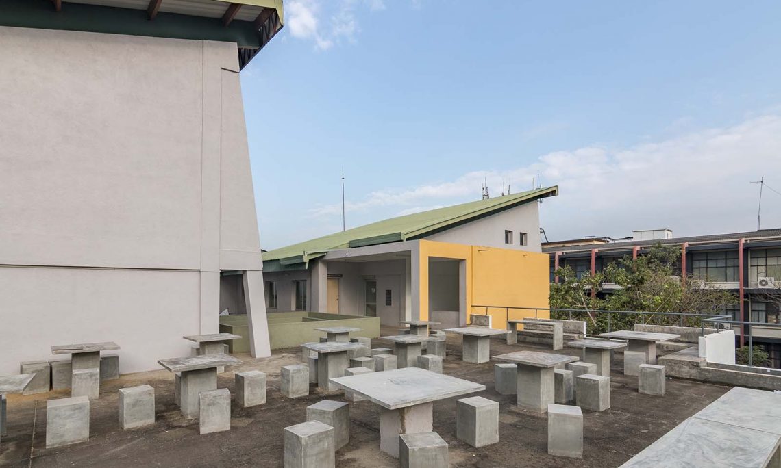
The plan shape of the center is staggered to give the non-obstructed view of the Sumandasa building, and further the sky line is too staggered to feel the openness of the place that it makes. The terraces were created as retreating roofs of the upper floor of the canteen which makes an extension to the Student activities at second floor level creating a state-of-the art University Student Center.
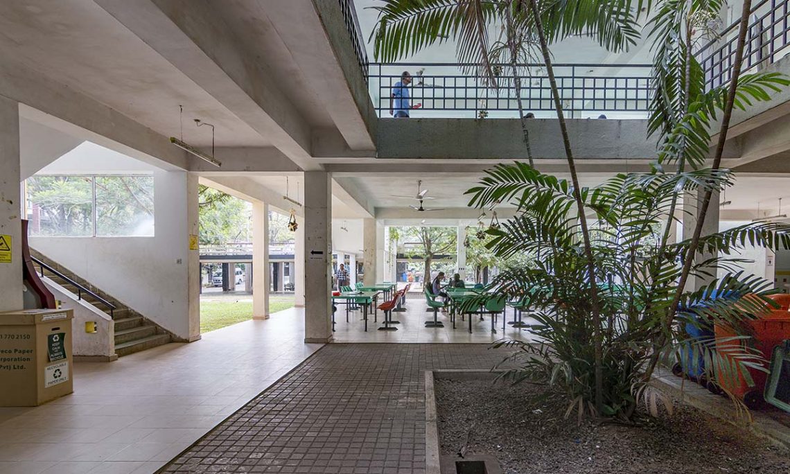
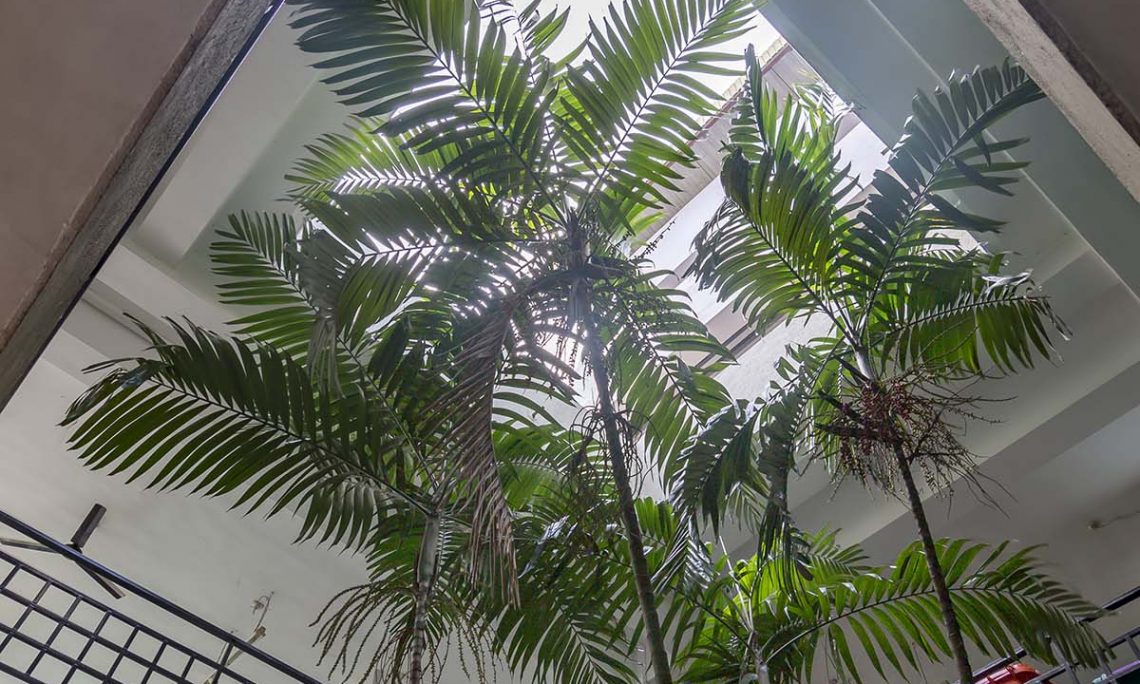
To meet the additional space requirements the mezzanines were created using the slope of the lean to roof which is a reproduction of the lean to roof style of the “Technical college era”. The ceiling colour of the roof is sky blue to give the sense of lightness.The internal three court yards are created in such a way that the open space inside the building flows and merge with outdoor space vertically and horizontally in to the building. The trees selected for the landscape for the court yards creates a ‘serene’ natural environment with the trees with flow down branches. The colour for external colonnade wall and internal wall all are selected for the shades of ‘white’ to ‘yellow ocher’ to merge with the leaves and trunks of the trees to enhance greenery. The building has no windows or doors except in the kitchen storage which is not visible and all there add to the concept of “None building”.

